- DataArts News
Four Steps to Informed Planning Using the KIPI Dashboard
- Posted Mar 21, 2023
Comparison is a normal part of leading an arts organization. When we are making big decisions, explaining our position to stakeholders, or simply monitoring our progress as an organization, knowledge about what outcome is typical and where our peers stand is essential. For example, if an executive director is talking with her board chair about financial goals, they might turn to field-wide benchmarks as a starting point. What do experts recommend in terms of working capital reserves? With some research, they can find plenty of advice, but things become more complicated quickly. What’s realistic for an organization of their size? How does funding availability within their local market affect their plans? Does their museum have different capital needs than a community theatre?
A key ingredient in benchmarking is context. This includes everything from details about your organization and community, broader trends within the field, and your organization’s specific strategies and needs. SMU DataArts KIPI Dashboard is designed to provide you with benchmarking data that takes your context into account and can inform your organizational planning.
What is the KIPI Dashboard?
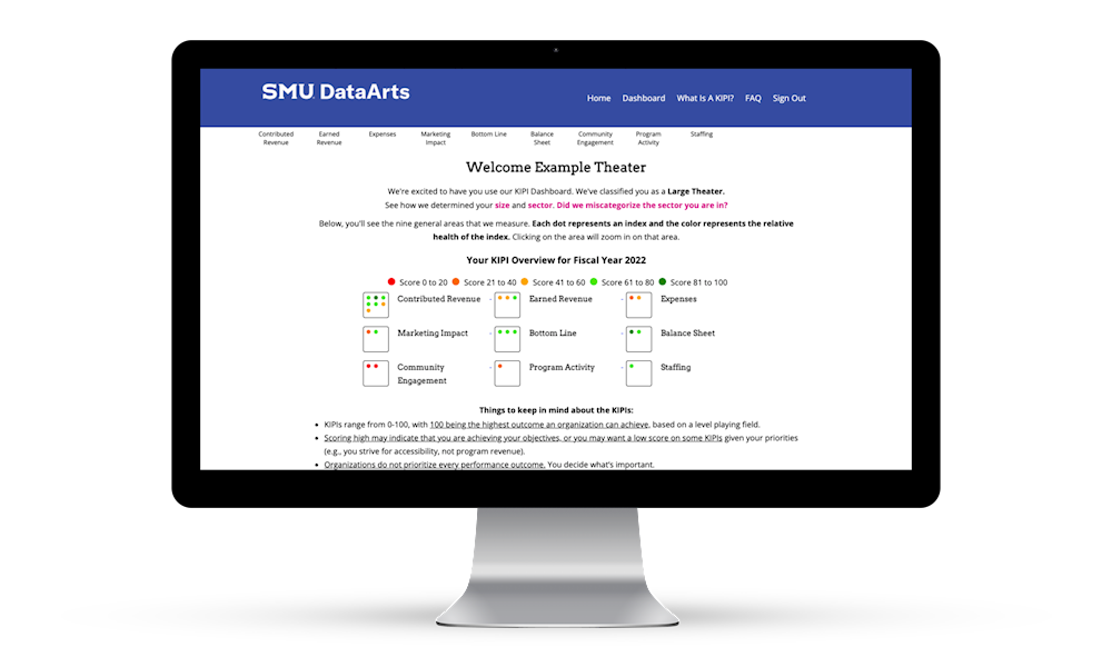
The KIPI (Key Intangible Performance Indicator) Dashboard is a free diagnostic tool, that provides your organization's financial and operating performance results relative to organizations like yours nationally so you can assess health and sustainability, and hone strategic decisions. Organizations that complete the Cultural Data Profile have access to their private dashboard containing their unique scores on 24 different measures. These scores take into account the different aspects of your organization such as size, where you're located, age, and sector. The dashboard is available to all CDP participating organizations with expenses over $30,000 and NTEE A codes A1-A26 and A40-A99 (A = Arts and Culture).
Your institutional knowledge combined with data provided by the KIPI Dashboard offers you and your colleagues context-rich insights that put you at an advantage for effective decision making. Planning should rarely be a solo effort, so enlist other colleagues from your organization to join you from the beginning as you follow these steps.
Step 1: Center Your Mission
Before looking at any data at all, start by centering your mission. Take a moment to ensure that your planning committee agrees on how you provide value to people, who those people are, and the purpose behind your programs and activities.
It may sound surprising that understanding your value and mission is our first step, especially given the data-focused nature of the dashboard, but this idea is backed by research. In 2020, SMU DataArts conducted two rounds of research on the alchemy of high-performing arts organizations, in partnership with the Wallace Foundation. The first study was focused on organizations with annual budgets between 650,000 and 4 million. The second study expanded the budget range to include smaller organizations and focused on high-performing organizations that primarily serve communities of color.
In both of these studies, our research team found that the keys to success are community orientation and high-quality programming – and that these intangible things lead to success in areas measured in the KIPI dashboard. As you use the dashboard to understand your performance, you’ll come back to this understanding of your mission and value to apply what you learn to your organization.
Step 2: Explore and Find Your Scores
Log into the KIPI Dashboard and find your scores. Start by noting which scores are high and which are low. Do these scores align with your expectations? Then, take a look at which scores are trending up or down. When you see a score that stands out, click through to make sure you understand the indicator that it's referencing. Each page contains information about how that indicator is calculated.
When you are looking at higher scores or those trending upwards consider the following:
- Are these areas that you currently perceive as strengths for your organization?
- Is this an area where you are already investing resources? For example, if you have been deliberately investing in grant writing and your foundation revenue scores are higher than expected, that is something to be celebrated.
- Do you see any surprises? You may score higher than you would have guessed in some areas, because the scores take into account what we know about how all organizations operate. For example, instead of comparing your working capital to a standard benchmark like 3 or 6 months, your scores are based on the current reality within the sector for organizations like yours.
When you look at lower scores or any that trend downward consider the following:
- Is this indicator aligned with my strategy and mission? You may find indicators in the dashboard that just don’t make sense for your particular mission. For example, if your organization primarily provides free or low-cost programming, which you intentionally subsidize with contributions then lower earned revenue scores are expected for your organization. This is not an indicator you need to spend time thinking about.
Finally, even if a score is not particularly high or low, you may want to examine it more closely if it aligns with your mission or your existing priorities.
Your goal for this initial exploration is to identify 4-6 scores you would like to analyze more deeply. To review, here are some criteria that might nominate a particular score for this list:
- Successes to celebrate – areas where you have already invested and where scores are high.
- Unexpected bright spots – can you determine what is driving that success?
- Growth areas - Mid-range or low scores where improvement makes sense for your organization because they align with your mission.
- Existing priorities - Indicators that align with the existing strategy for your organization, either as a documented strategy, or topics that consistently come up in conversation among your staff and board.
Step 3: Break Things Down
Your next step is to break down this list of 4-6 scores into more detailed data points that will help you plan. Imagine for a moment looking at the KIPI Dashboard, and then establishing a goal along the lines of “raise our Unrestricted Contributions score by 3 points!” and leaving it at that. No one would know where to start! That’s because these indicators are well-suited to assessing areas of success and opportunity, but many of them are too high-level to inform specific action steps and decisions. In order to uncover the details, start with the two data points used to calculate the indicator, which are listed in the dashboard. From there, think about the more detailed data points that contribute to these high-level numbers.
Consider the indicator Trustee Contributions as an example. The two data points used to calculate this indicator are unrestricted trustee contributions and total expenses.
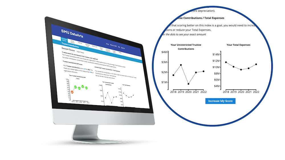
In this case, Total Expenses is only included to contextualize Unrestricted Trustee Contributions, which will be our focus. There are more specific data points that drive our Unrestricted Trustee Contributions, such as the number of board members contributing, and the total number of board members. We might also look at the average contribution size. Lastly, we can look at any policies we have related to this number, such as a give/get requirement for board members to fundraising or contribute a certain amount. All of these number can also be looked at as trends, or in comparison to peer organizations, for which you might turn to SMU DataArts Analytic reports.
These more detailed numbers start to direct us towards strategies that might make a difference for this overall indicator. For example, we might decide to change our give or get requirement, focus on other ways to increase gift size, attempt to motivate a larger number of board members to give, or work towards expanding our board, thereby growing our pool of potential trustee contributors.
Step 4: Ground Your Planning in Intangibles
The final step is to ground your planning in intangibles about your organization. Two important intangibles were mentioned in the first step: community orientation and quality programming. Now is a good time to return to these, as certain decisions that you could make based on the data might be in tension with your mission. For example, if you have a board whose primary purpose is to ensure direct communication and a sense of ownership within the community you serve, expanding the board or increasing financial requirements might contradict that purpose.
Also, consider intangible factors related to staff and organizational capacity. For example, if you are focusing on improving your fundraising indicators, just setting higher goals alone probably won’t be enough. You might need to seek out additional expertise in the form of training for existing staff or additional help. What kind of additional investment in capacity will help you achieve your goals?
Each organization is different, and this step is just a reminder to pair the data with your own expertise and knowledge about what’s happening at your organization.
Bringing It All Together
At this point you have learned a lot about how your organization is performing and developed some concrete goals. Next, connect what you’ve learned to any existing planning processes at your organization. Here are some areas to consider:
- Annual budgeting process: This is a great place to implement the things you’ve explored in your work with the KIPI dashboard. If you don’t currently go through an annual budgeting process, or you are new to it access our building blocks for financial health resources.
- Strategic planning: If you already have a strategic plan, review it before you explore the KIPI dashboard so it can inform your discussions. If you are considering strategic planning soon, make sure to incorporate your KIPI dashboard assessment into your upcoming process.
- Project planning: Your KIPI analysis might also inform planning for more specific projects like an annual giving campaign, or your marketing activities for the next quarter.
Benchmarking your organization is an important part of planning for the future, but context is required to make meaning from the data. The KIPI Dashboard provides benchmarking scores that take into account important context for your organization, and with this process you can combine those scores with your knowledge about your organization in order to infuse data into your planning process.
Comments
Leave yours below.